
Public Sector & Civic Design: Designing public outreach campaigns for municipalities and government agencies, including bilingual materials that reach English & Spanish communities. From utility and infrastructure initiatives to transportation studies, I create visual communications that translate complex civic info into messaging people can understand and act on.
East Moline Get the Lead Out
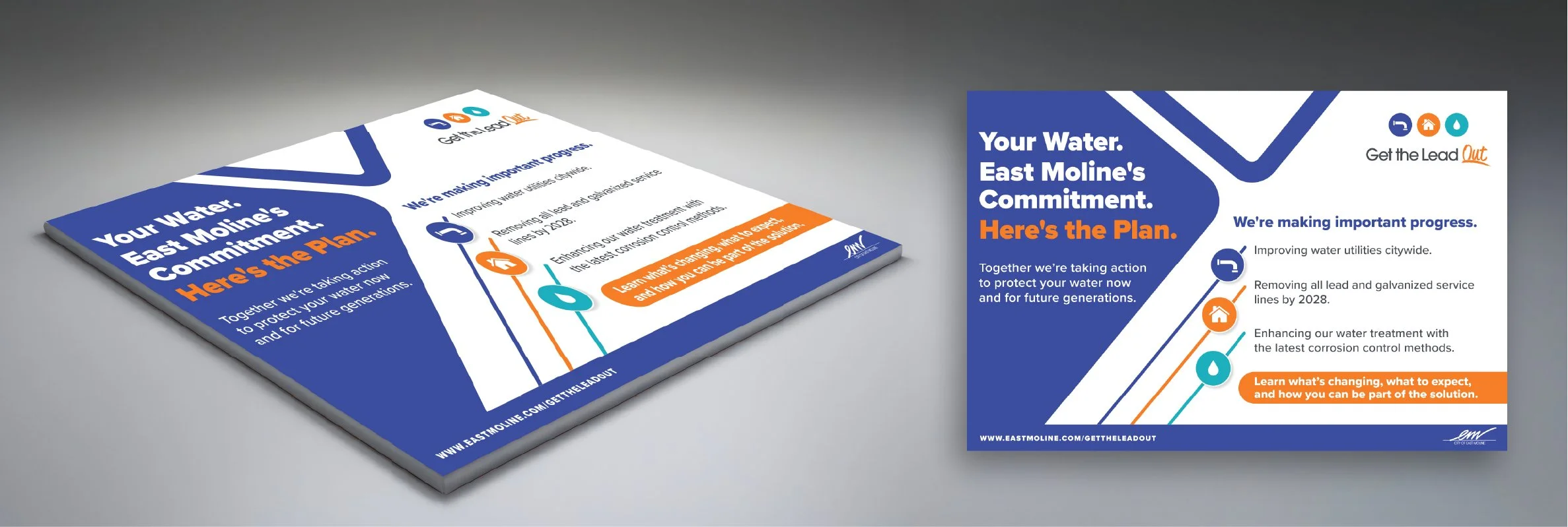
Your Water. East Moline's Commitment. Here's the Plan. | Exhibit Board
Problem: Residents needed a clear, accessible overview of a complex city wide water safety initiative.
My Approach: I structured the board around three commitments using a color coded icon system, pairing a bold action headline with a clear CTA that invites residents to learn more and get involved.
Solution: One board that gives residents the full picture, part of a multi piece bilingual public outreach campaign spanning exhibit boards, handouts, postcards, and digital.
East Moline Get the Lead Out
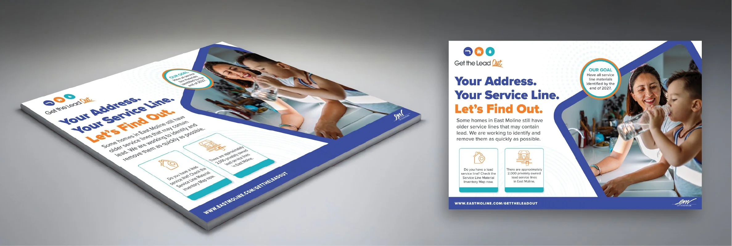
Your Address. Your Service Line. Let's Find Out. | Exhibit Board
Problem: Residents needed a personal way to find out if their own home had lead, not just general citywide info.
My Approach: I paired a headline that speaks directly to residents with a family photo making the issue feel personal, added two callouts, building urgency without alarm.
Solution: Turns an abstract infrastructure goal into a direct question residents can answer for their own address, part of a multi piece bilingual public outreach campaign spanning exhibit boards, handouts, postcards, and digital.
East Moline Get the Lead Out
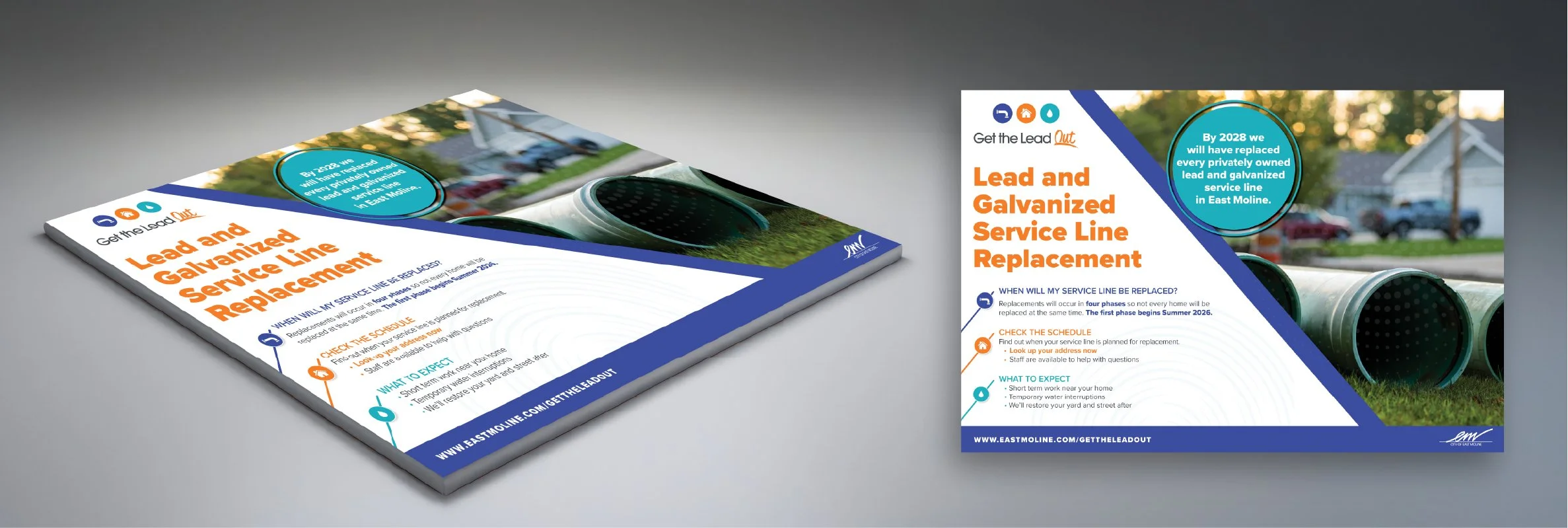
Lead and Galvanized Service Line Replacement | Exhibit Board
Problem: Residents had practical questions about the replacement process; when it would happen, was their block affected, and what disruption to expect.
My Approach: I organized the process info into three questions using the same icon and color system from the other boards, so residents could scan for the answers they needed.
Solution: A scannable board that breaks down the replacement program into three sections, using consistent icons and visual language throughout a multi piece bilingual campaign.
East Moline Get the Lead Out
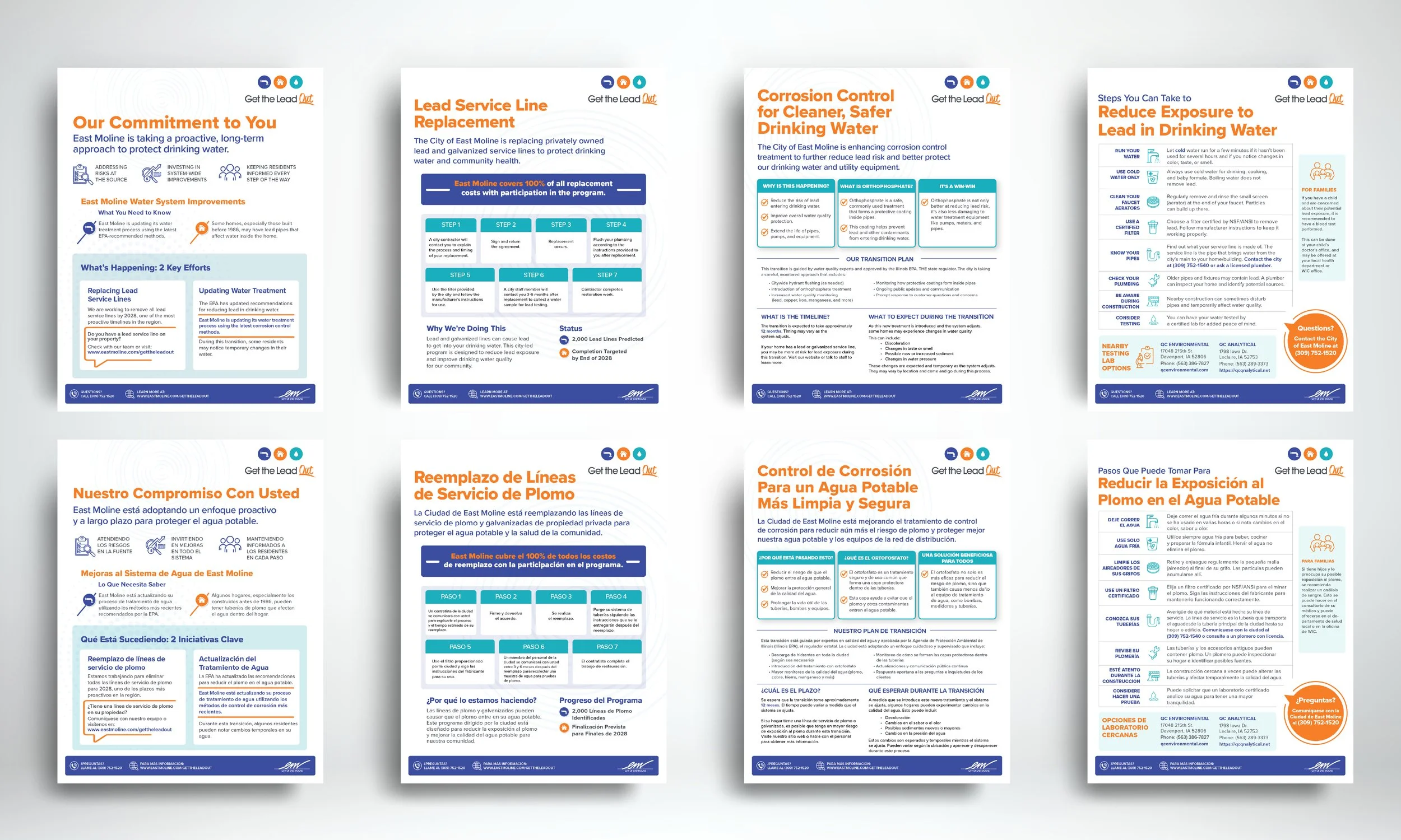
Bilingual Handout Series
Problem: East Moline needed to explain two complex water safety initiatives to residents in both English and Spanish. A city wide commitment overview and a technical corrosion control update, without causing alarm.
My Approach: I designed four handouts total across two topics, organizing each into clear, scannable sections using consistent brand colors and icons. Working from the English versions I designed, I translated the copy into Spanish and built the Spanish sheets with the same visual structure.
Solution: A bilingual handout series that makes complex water safety information accessible, readable, and consistent across both languages.
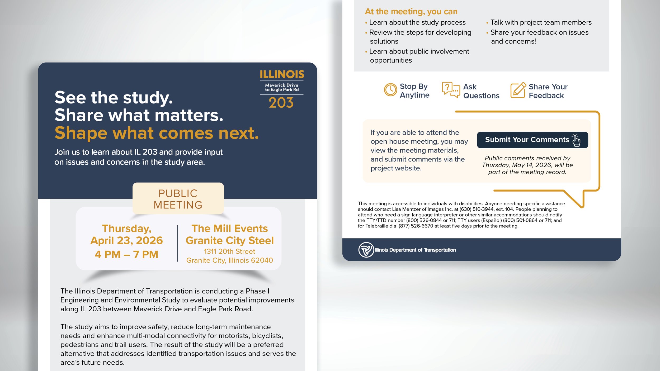
Madison County | IL 203 Study | Meeting Announcement Email
Problem: The public meeting needed a digital touchpoint matching the print campaign.
My Approach: I adapted the postcard's headline into an email format, organizing the meeting details into scannable sections.
Solution: A digital piece that extends the campaign's reach and consistency.
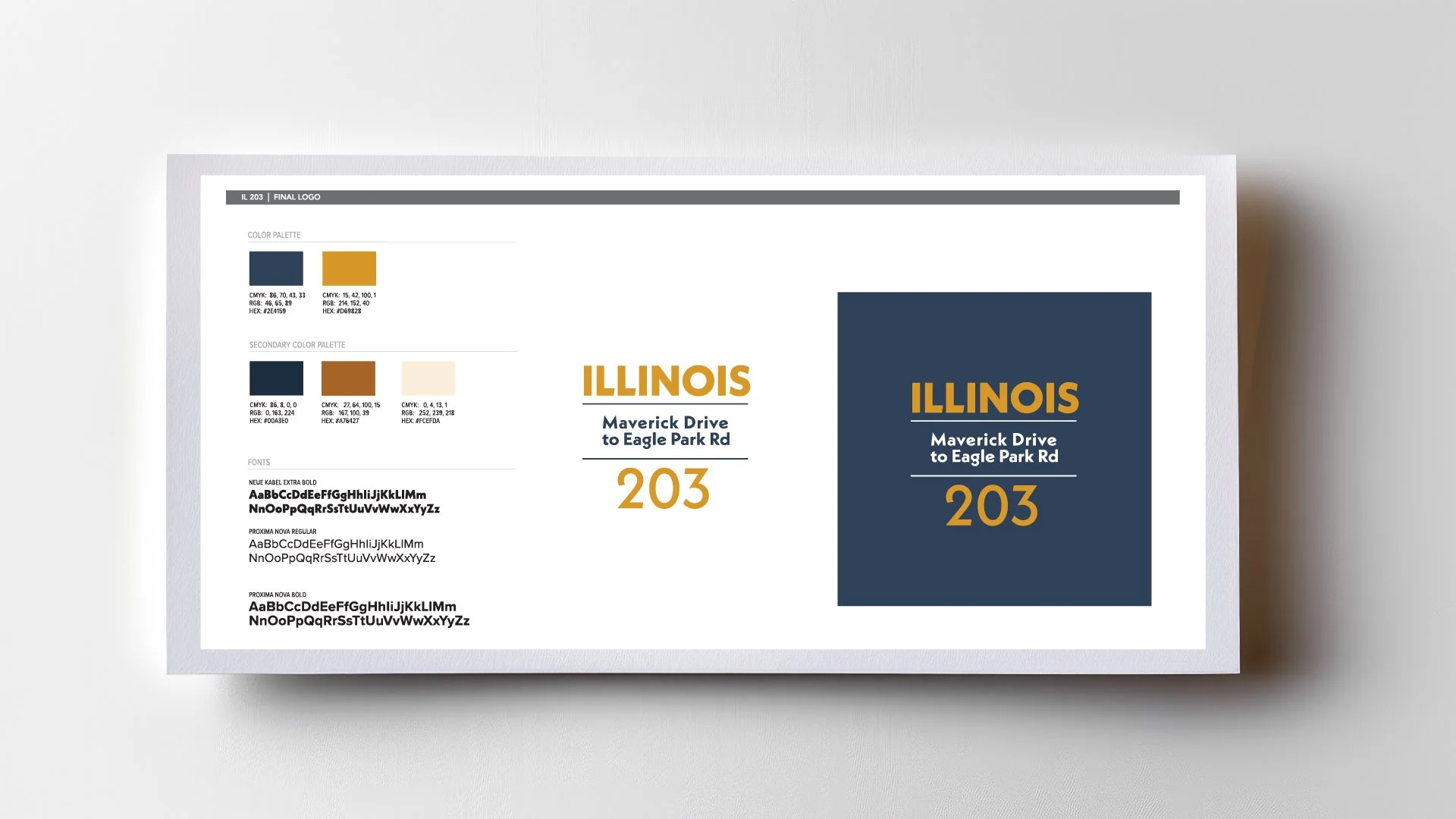
Madison County | IL 203 Study | Brand Identity
Problem: Images Inc. needed a brand identity for the IL 203 Study, built quickly with minimal creative direction.
My Approach: I developed the color palette, logo, and typography, choosing navy and gold to reflect trust and authority, paired with an attention grabbing accent similar to road signage.
Solution: A cohesive brand identity that carried consistently across boards, postcards, and email.
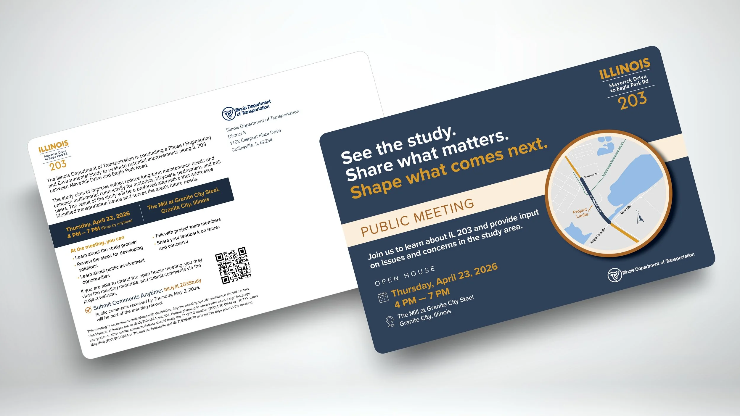
Madison County | IL 203 Study | Public Meeting Postcard
Problem: IDOT needed a mailer that would actually get opened and drive attendance.
My Approach: I paired a bold headline with a custom project area map on the front and meeting details on the back, using the brand system I developed for the study.
Solution: A direct mail piece that turns a routine notice into an invitation.
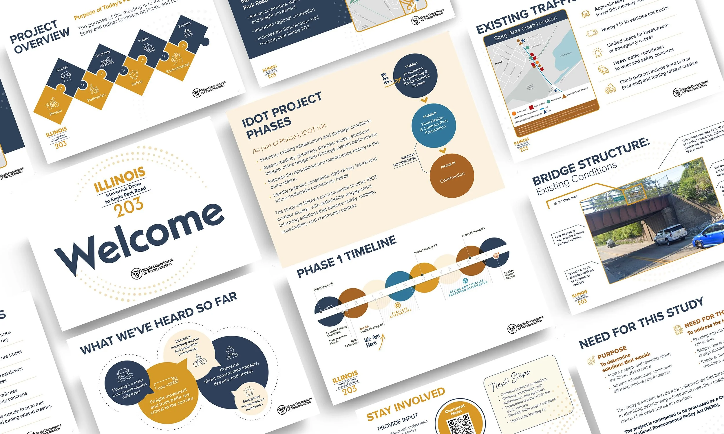
Madison County | IL 203 Study | Public Meeting Exhibits
Problem: A complex transportation study needed to be communicated clearly to the IL 203 community.
My Approach: Designed a structured PDF using the established IL 203 brand system, consistent typography, color, icons, and layout to make technical info scannable and approachable.
Solution: A polished, on-brand document that translated a multi-phase engineering study into something the community could actually understand and engage with.